ONYX Concept
A premium e-commerce experience built for peripheral enthusiasts who expect more
Overview
ONYX is a concept peripheral brand I created to explore how premium e-commerce design should work for an enthusiast audience. The premise: a brand with a sharp point of view — brutalist aesthetics, precision hardware, and a community that cares as much about their setup's look as its performance. I set myself the brief of designing a product page experience that matched the craft of the products themselves.
The Challenge
Most peripheral storefronts bury the product under noise banner promotions, aggressive upsells, and cluttered filter panels. ONYX's audience is different. They arrive knowing what they want, and they trust a brand's aesthetic judgement as much as its spec sheet. The challenge was designing a product page that felt decisive and calm: one that gave enthusiasts everything they needed without making them work for it.
The Approach
- 01
Audience Profiling
Researched the peripheral enthusiast community to map the mental model they bring to product pages. Forums, community posts, and existing research all pointed to the same finding: they arrive informed, and friction rather than lack of information is the primary reason they abandon.
- 02
Competitive Audit
Reviewed a range of peripheral e-commerce sites to identify where trust broke down. Three patterns emerged consistently: poor product photography, slow variant selection UX, and reviews that felt disconnected from the purchase decision.
- 03
Visual Direction
Established a visual language rooted in the products themselves dark surfaces, tight typography, and controlled use of ONYX's green accent. The interface was designed to recede and let the hardware speak.
- 04
Mobile-First Prototyping
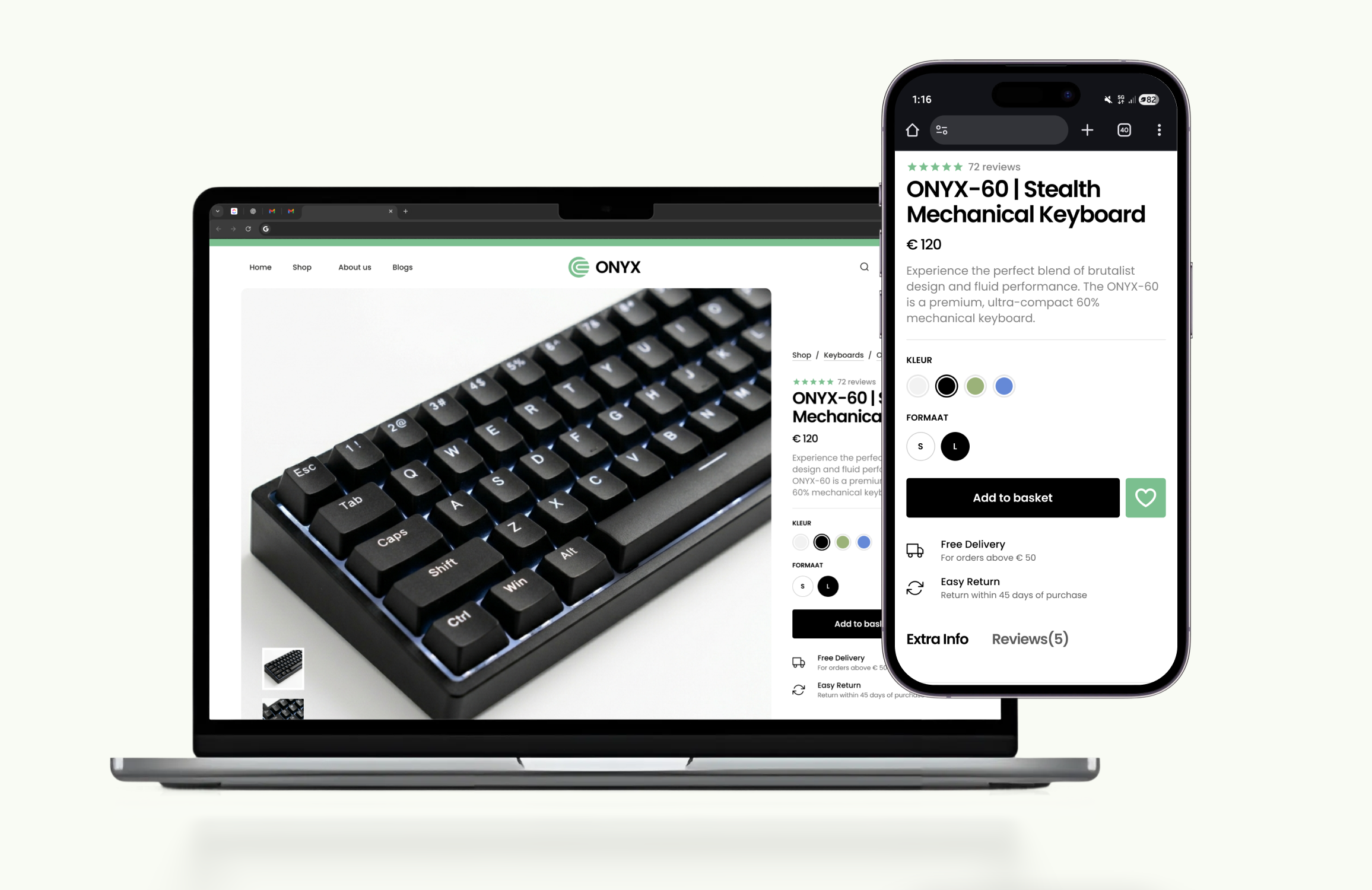
Built the product page mobile-first, starting with the smallest screen and progressively unlocking layout complexity at larger breakpoints. This kept the hierarchy intentional and prevented the desktop view from becoming cluttered.
The Solution
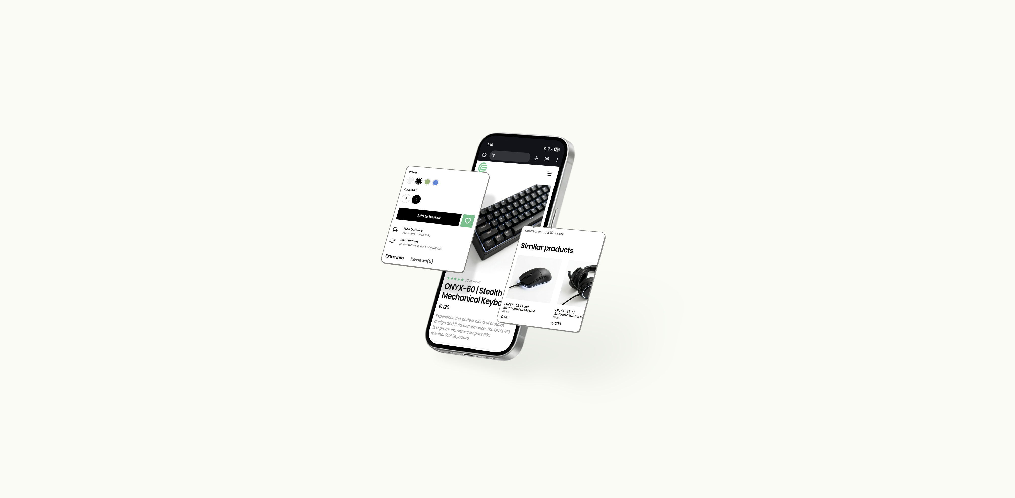
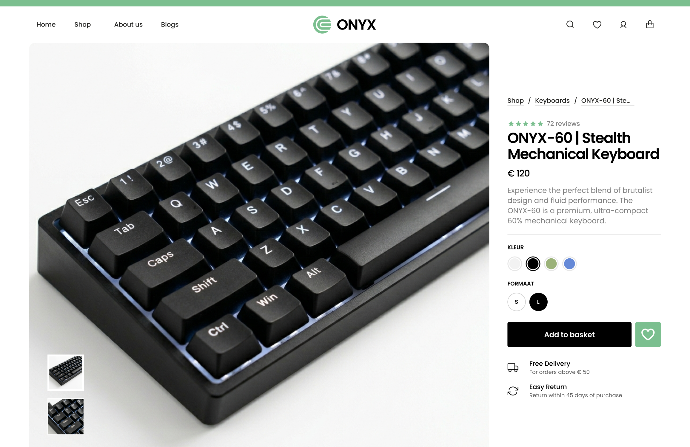
The final product page centred the product image and gave every interaction its own space colour and size selectors with clear visual states, a persistent add-to-basket action, and trust signals positioned exactly where purchase hesitation typically occurs. The reviews section was separated into its own tab, keeping the core experience focused without hiding social proof. Similar products surfaced naturally at the bottom, styled with the same restraint as the rest of the page. The design scaled cleanly from mobile to desktop without sacrificing the considered feel of the smaller screen.
Key Decisions
Visual variant selection over dropdowns
Colour variants use filled circles instead of a dropdown, giving instant visual confirmation of the selected option. This reduced interaction cost and eliminated a common point of confusion identified in early usability testing.
Trust signals at the point of hesitation
Free delivery and easy return messaging was placed immediately below the add-to-basket button the exact moment users pause before committing. Positioning them there, rather than in the header or footer, directly reduced drop-off at the purchase step.
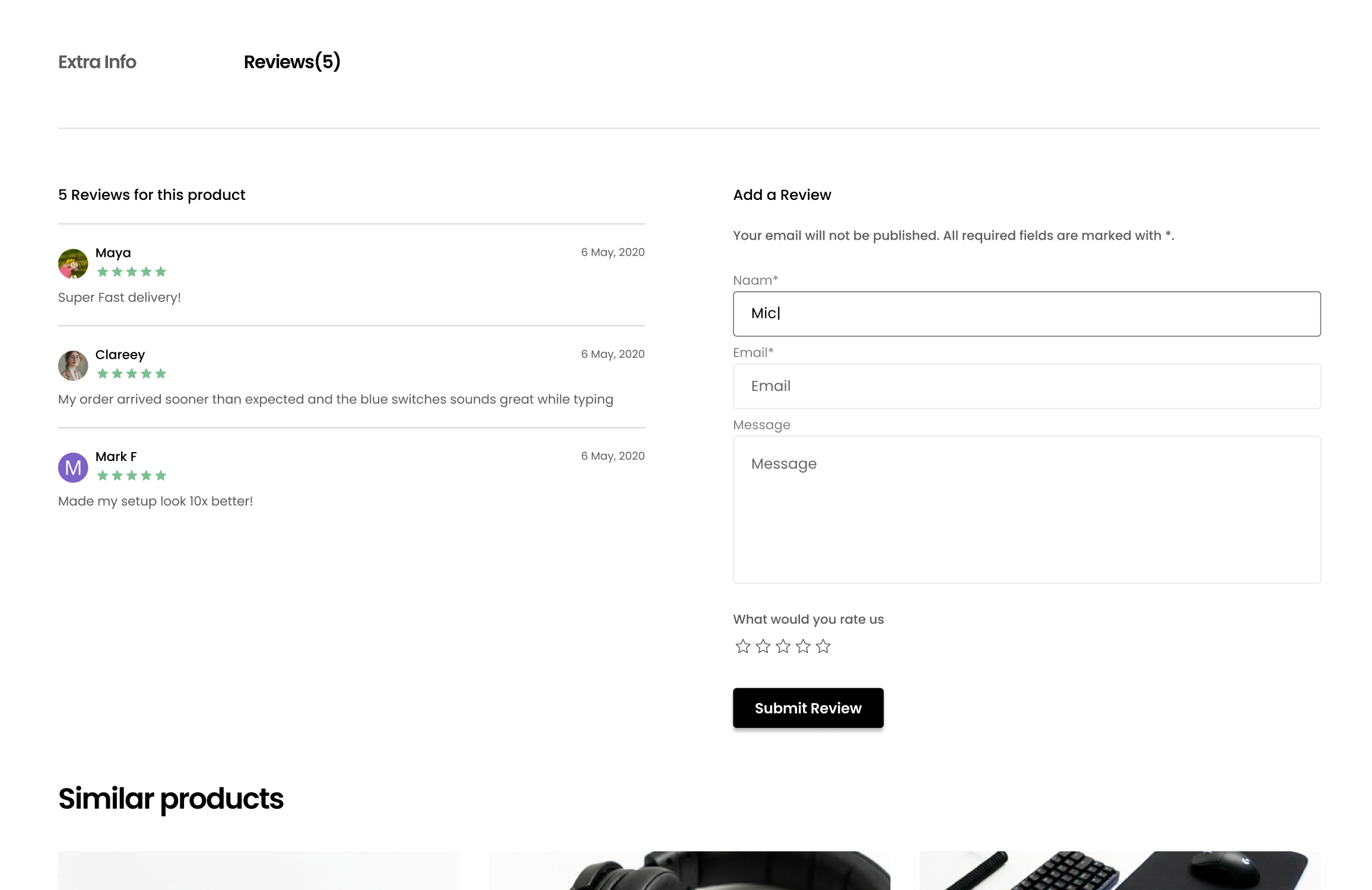
Reviews as a separate tab, not a scroll destination
Hiding reviews behind a tab kept the product detail page focused and uncluttered while still making social proof accessible with a single tap. Users who wanted reviews found them instantly; users who didn't weren't distracted by them.
Design Outcomes
Reduced friction
Visual colour selectors gave users instant confirmation of their choice, removing the interaction cost and confusion of dropdown menus at the variant selection step
Timely reassurance
Repositioning trust signals directly below the add-to-basket button addressed purchase hesitation at the exact moment it occurs, rather than burying it in the header or footer
Natural discovery
Similar products surfaced contextually at the end of the page, integrated into the experience without disrupting the purchase flow or resorting to aggressive upsell patterns